In my previous article, I discussed The Importance of Logo Design, explaining what goes into creating a corporate identity and the finer points a logo should embody. Here, I will explore colour in more depth, building on that brief introduction, because the language of colour in design is not a subject you can simply skim over.
Indeed, entire logo concepts can be developed around the effects of colour alone. From a designer’s perspective, I can confidently say that colour is one of the foundations of a design and can make the whole piece look either successful or unsuccessful.
Through their associations, colours can communicate your character, corporate identity, personality, and even your outlook on life. You can see how colours reflect emotions and shape moods. Imagine you are having an unhappy day and need to go out. What would you choose to wear? Probably something dark. Similarly, when you sit down to design in a gloomy mood, the colours you choose are likely to reflect that mood. When I experience this as a designer, I usually take a break and try to do something enjoyable to lift my spirits. Keeping my personal mood out of my work is one of my strongest professional principles. I always approach corporate design work professionally and take care to use colour appropriately.
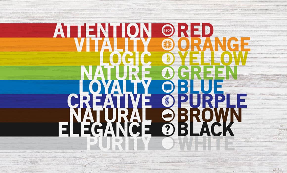
The most commonly used colours are red, black, blue, green, brown, purple, and pink in that order. Let us look at the meanings these colours evoke and communicate to the viewer.
Red: There is a familiar Turkish saying: “Make it red, even if it costs a little more!” There is a reason behind it: red represents vitality and dynamism, bringing a sense of happiness to its surroundings. It is also an appetite-stimulating colour, which is why many food companies deliberately choose red for their logos.
Black: Black often suggests emotion and sadness, while also representing power. Although it symbolises sadness and mourning in Turkey and many other countries, in Japan it represents happiness, in contrast to those countries. Its association with dignity may also make it one of the most popular colours.
Blue: Blue is the colour of the endless sky and the vast sea. It is one of the colours I enjoy using in my work. It represents peace, calm, a sense of freedom from limits, and freshness. Think of the peace you feel after spending hours looking at a deep-blue sea. That is the effect of blue, and it is why the colour matters so much in design.
Green: Green represents nature and spring. Its vitality gives it energy, refreshing people and inspiring trust. It is frequently used in finance to convey that sense of trust. It is also one of the most popular colours in food and healthcare because of its associations with nature and the environment.
Brown: Brown is the colour of genuine emotions and discipline. Scientific studies suggest that brown has an accelerating effect on the human brain.
Purple: Purple represents grandeur and a luxurious lifestyle, although I would not say it is used very often in design. A colour favoured by young women and women more generally, purple actually represents neurotic feelings.
Pink: Pink has a happy effect on people. It directly conveys a sweet, cheerful, and charming image. Especially popular with children and used in child-related sectors, it represents love and comfort.
The Language of Colour in Design is, as you can see, extremely important. Attention should extend beyond typography or the details of a logo’s emblem: the logo also needs the right colours to represent the organisation and its industry. Even the negative feeling conveyed by a logo and its colours can cost a business customers. Imagine a bottle of water with a red label. How healthy or cool would it feel to you? Something to think about!