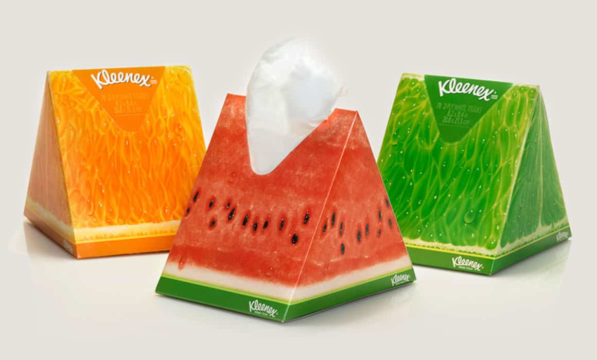
Today, I wanted to explore an important subject for anyone interested in design, and I chose packaging. Packaging is like a product’s clothing: it sometimes commands more attention than the product itself, helps it stand out from competitors on the shelf, and gives it a presence. The more successfully packaging is designed, the more effectively it attracts its target audience.
Although packaging primarily exists to protect a product from external influences and keep it fresh, design turns it into an advertising and marketing tool in a competitive market. Packaging protects a product against damage, impact, moisture, and drops, while its design announces what is inside and allows the product to say, “I’m here.”
Because packaging design gives the product a voice, the designer needs fresh, well-judged ideas. In the packaging projects I have worked on, I have aimed to create eye-catching designs that bring the product forward, draw selective attention, and put it ahead of competing products. This requires thorough research into the product’s features, history, customer profile, and competitors. Only after that research can a sound, successful packaging design emerge.
As I discussed in “The Language of Colour in Design”, colour is also one of the most important factors in packaging design. Choosing colours that evoke the right emotions in potential buyers, and analysing how colour can encourage a purchase, helps make a design successful. Colours can make packaging feel lively, cheerful, warm, and energetic, or they can make it feel cold and convey negative, unpleasant emotions. The imagery, patterns, typefaces, and, above all, colours must therefore be chosen for the target audience and brought together appropriately in the design.
According to research, consumers take three seconds from first noticing a product to deciding whether to buy it. Forming an emotional connection in that brief moment and encouraging the customer to choose you demonstrates the power of the right packaging design.