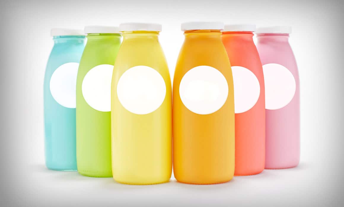
One way to communicate a product and its intended message as accurately as possible through packaging design is to use the right colours. Chocolate products, for example, are generally designed in warm tones such as red and brown. Packaging for chocolate rich in pistachios uses green alongside images of pistachios for emphasis, while black is preferred for dark, or bitter, chocolate. One reason for these colour choices is to communicate what the product is and what it contains as quickly as possible at first glance, before anyone reads the text on the package, and to create the desire to buy it.
Red is widely used in packaging design in the food sector. Because red stimulates people’s appetite, it dominates not only packaging but also corporate designs such as the logos and signage of restaurants and fast-food chains. Of course, launching look-alike packaging simply because of this association with red would not make much sense. Analysing competitors and taking innovative steps always help a brand and its products stand out. Using a completely contrasting colour can also help a new product make an impression quickly. These are all marketing strategies.
Using the right colours is very important when designing packaging. If, for instance, you design a red label for a bottle of water, it will evoke warmth rather than the cool, fresh feeling associated with blue. Naturally, a bottle of water that feels warm is hardly appealing to someone who is very thirsty in hot weather. That is why using colours in the right places and in the right proportions has a significant influence on a product’s sales success or failure.
The most fundamental purpose of packaging is to protect the product and extend its shelf life. Its second, commercial purpose is to present the product to consumers, explain its contents, and encourage demand and purchase. Packaging should therefore be made from quality materials while also visually calling out to the consumer, “I’m here!”
When you are walking down a supermarket aisle, the packaging’s design or colours are the main reason for that brief moment that suddenly stops you and makes you examine, and perhaps buy, a product you have never tried before. The first five seconds are important for packaging to communicate with the consumer. At this point, our task as designers is to use not only colour but also our creativity to develop packaging that is different, new, and attention-grabbing.
In my earlier blog post, “What Should Packaging Design Be Like?”, I discussed the relationship between product, packaging, and consumer, and touched on what makes good packaging. I should emphasise once again that, although colour is a key factor in packaging, it must be supported by creativity.