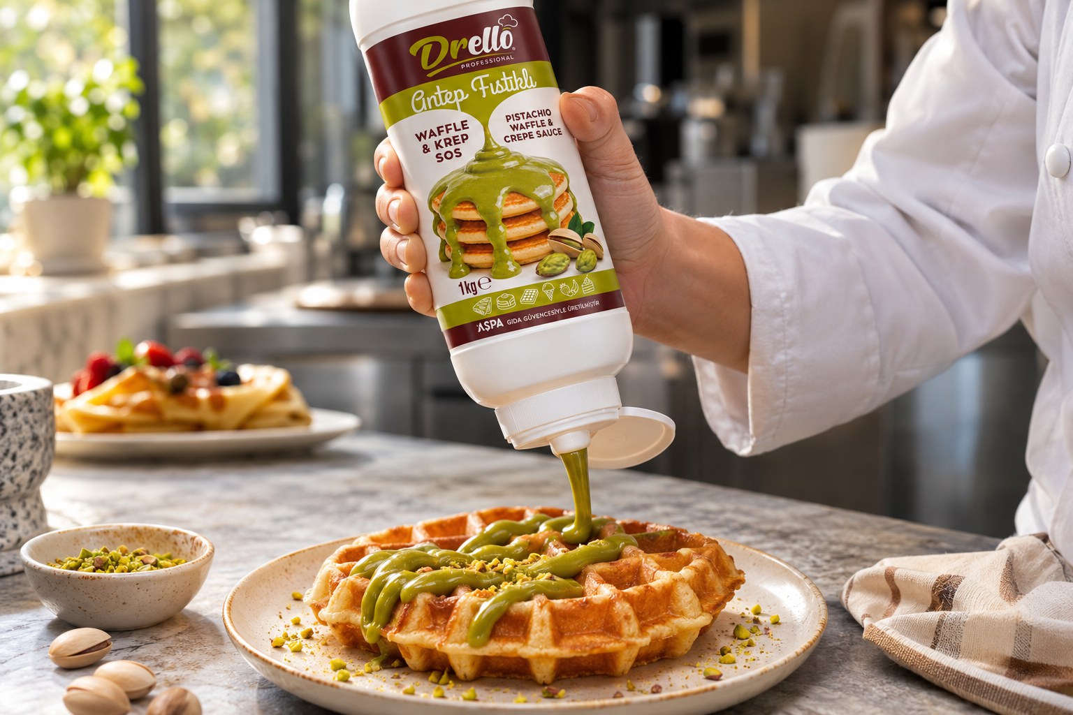
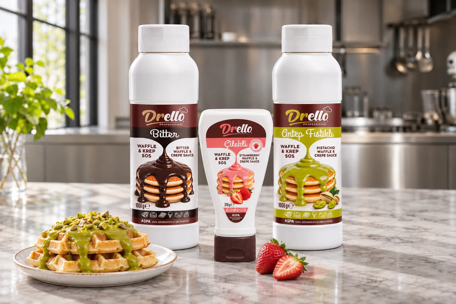
Logo refresh and packaging for Gelincik’s Drello Professional range (pralines, dragées, waffle and crepe sauces). The client sent a one-colour logo; I redrew it, fixed it in two colours, red and brown, and carried the same system across the sauce bottles, the buckets and the catalogue.
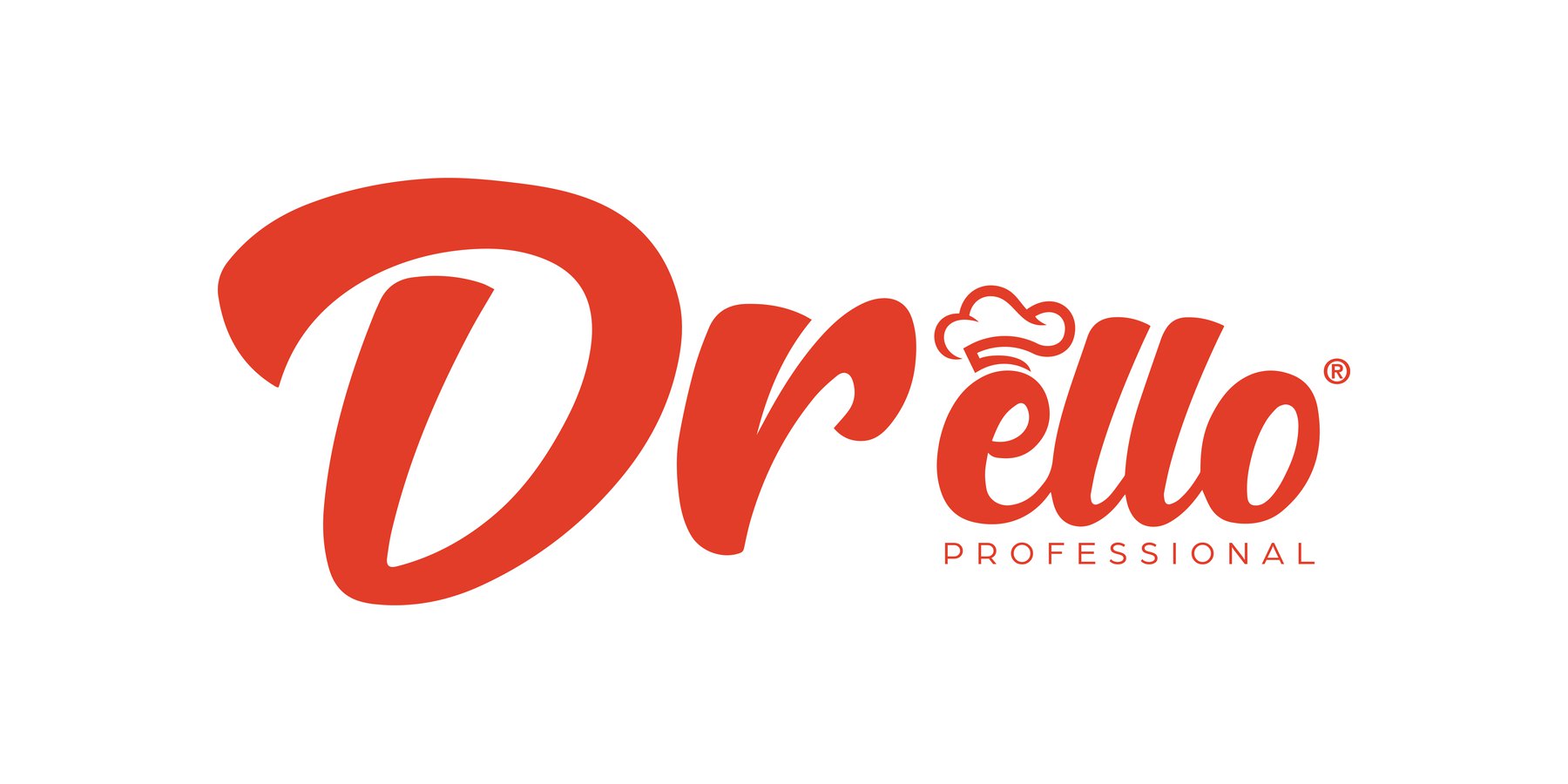
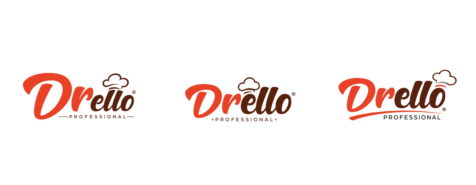
The logo we received. The heavy “Dr” and the thin “ello” were out of balance, the chef’s hat was cramped and the “PROFESSIONAL” line looked loose.Three directions. I moved the chef’s hat onto the “o” and tried three layouts for the “PROFESSIONAL” line, checking each one at small sizes.
RedPantone 485 C
BrownPantone 4695 C
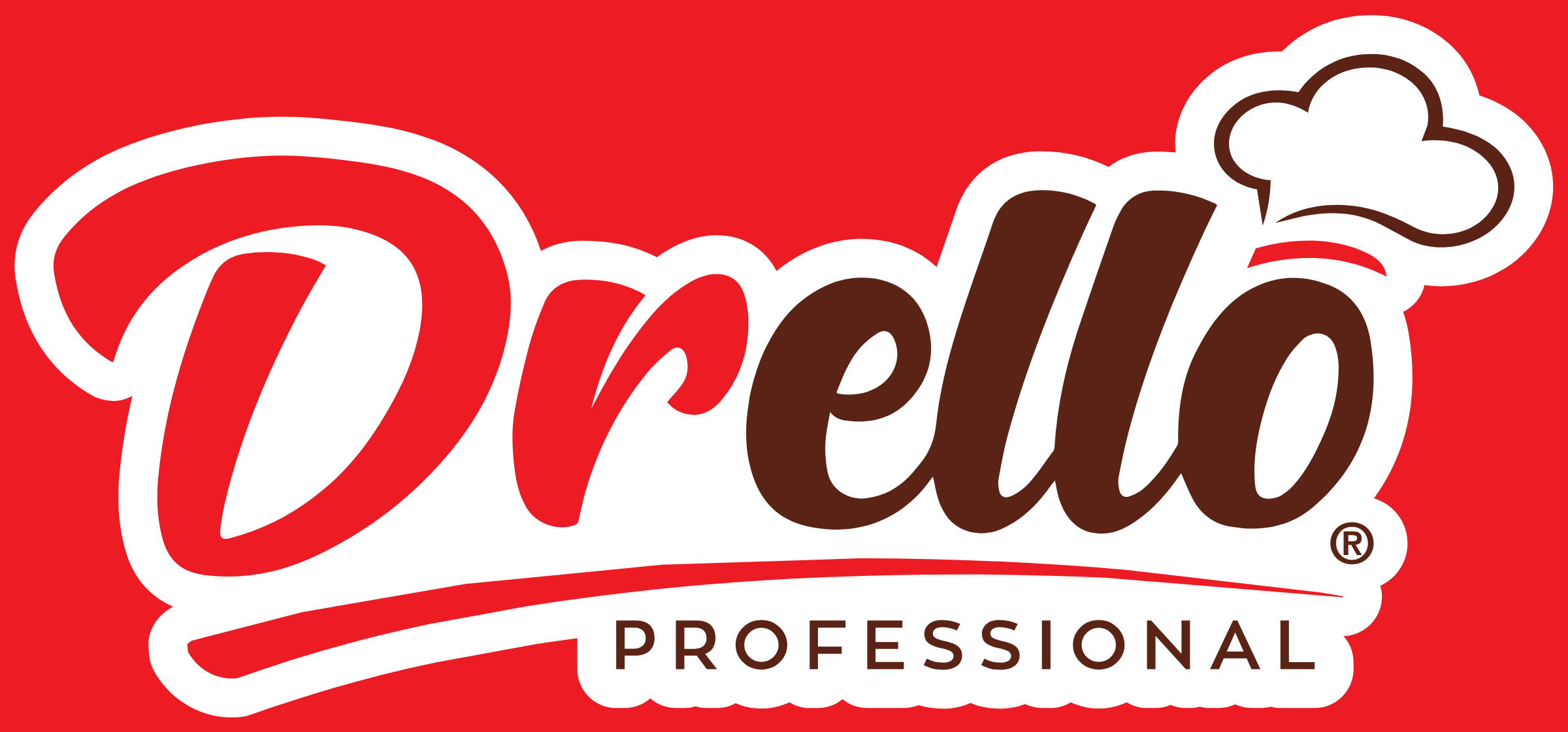
Final logo. “Dr” and the swash in red, “ello” in brown; the chef’s hat sits on the “o” and the underline sweeps beneath the name.Across the range. The logo sits in the same place on every bottle; colour and product image tell the flavours apart. The same layout went onto the buckets and the catalogue.
Let’s work together.
A new brand, a packaging refresh or a fresh perspective on your existing designs. Let’s discuss your project.