Printing Techniques for Packaging Design
Printing Techniques for Packaging Design

Skip to content

Menu

Home / Journal

On design

Printing Techniques for Packaging Design

Printing Techniques for Packaging Design

Graphic design, aesthetic ideas, and printing techniques can greatly enhance the quality of product packaging. To ensure that your commissioned design has the same impact on the shelf, it must first be prepared for the chosen printing technique, and the prepress repro work must be carried out correctly. You should therefore begin by identifying the right printing technique for your product, then have your packaging created by a designer who understands that process.

A design may not be suitable for every printing technique. Successful packaging design is created with the printing process in mind.

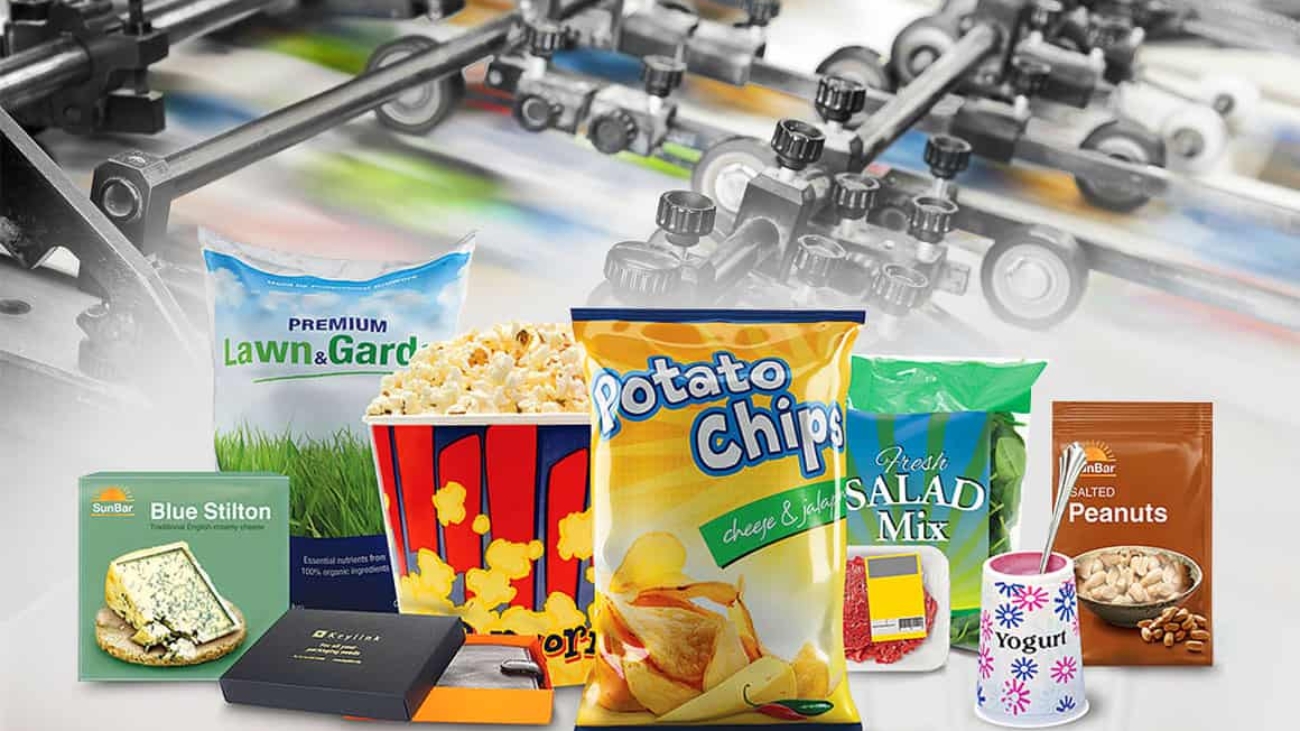
There are generally 5 different types of printing that can bring your packaging designs to life:

1- Offset printing

Offset printing is used on paper of many different weights. It is the most common printing process and is widely chosen for products such as business cards, magazines, books, newspapers, posters, and display boxes. It is one of the most versatile methods for packaging and can be used for labels and folding cartons in a wide range of sizes.

2- Gravure printing

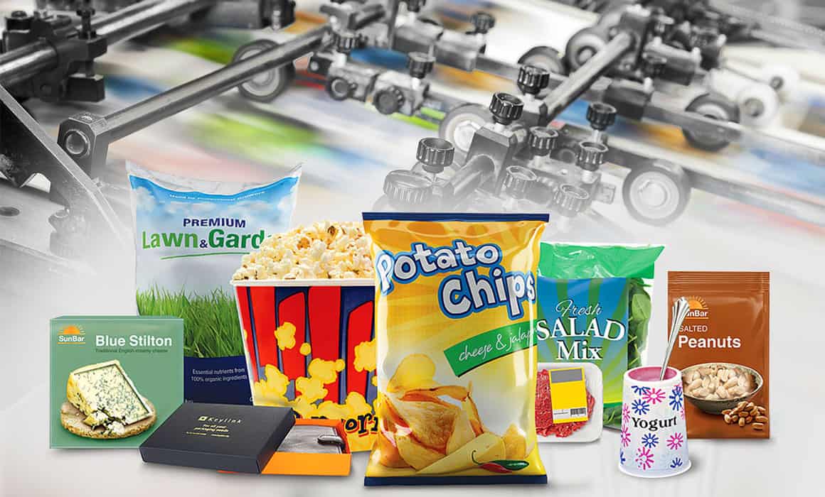
This is a recessed printing process in which machines engrave designs onto a metal plate using a diamond-tipped tool. During printing, ink is wiped from the surface of the cylinder, leaving ink in the recessed areas to be transferred onto the packaging and form the image. Gravure is commonly used for crisps, chocolate, biscuits, dry foods and nuts, powdered milk, coffee, and all kinds of food packaging. As these examples suggest, it is used for vibrant, eye-catching products. Print quality is another reason for choosing gravure, although the cost of the printing forms means that it is generally preferred for high-volume jobs.

3- Flexographic printing

Flexographic printing has a very important place in the packaging industry. It can be used for many products packaged in PP and OPP materials, including pasta, pulses, frozen foods, and sweets. Packaging printed using this technique is flexible, hygienic, and glossy in appearance. Although its quality is lower than gravure printing, it is highly economical in terms of plate costs and the speed with which production can begin.

4- IML printing

IML printing is also known as label printing. This process combines offset-printed material with plastic through injection moulding. Packaging for hazelnut or peanut butter, yoghurt, cheese, milk, puddings, and desserts can be produced using this technique. The label becomes integrated with its container, protecting it from damage. As these examples show, IML is a type of printing used mainly for food products.

5- Screen printing

Screen printing is the general name given to printing on materials such as glass, plastic, metal, and wood. In principle, a design is applied to silk stretched over a frame and exposed under suitable conditions, allowing ink to transfer to the product only through the areas exposed to light.

6- Digital printing

Digital printing is the process of using digital printing machines to print computer-created designs onto materials such as paper, canvas, fabric, synthetics, wood, and stone. Because no mould or printing plate is used, it is a suitable solution for variable and short-run product printing.
Başarılı Ambalaj Tasarımı Nasıl Yapılır

How to Create Successful Packaging Design

Skip to content

Menu

Home / Journal

On design

How to Create Successful Packaging Design

How to Create Successful Packaging Design

No matter how good a product is, it often fails to receive the recognition it deserves if it is not presented well.
Today, consumers buy more than a product: they also buy a feeling, a sense of trust, and a brand experience. This is why packaging design has become one of the most powerful elements of modern branding.

With competition growing so intensely on store shelves, e-commerce sites, and social media platforms, packaging is often the first thing that draws attention to a product.

So, how do you create successful packaging design?

1. Start by Understanding the Product and Its Audience

The first step in successful design is to communicate the right message, rather than simply look attractive.

A children’s product and a premium cosmetics brand cannot speak the same visual language.
Likewise, natural products and technology products belong to entirely different visual worlds.

The design process should therefore begin with these questions:

  • Who is the product made for?
  • Which competitors will it sit alongside on the shelf?
  • What feeling does the brand want to convey?
  • Should it look premium, natural, playful, or modern?

Without the right strategy, a design often remains a piece of work that looks good but has little impact.

2. First Impressions Are Crucial

A shopper typically spends just a few seconds looking at a product in a store.
If the product fails to attract attention in that brief moment, it often loses its chance.

Good packaging design:

  • Stands out from a distance,
  • Is easy to read at a glance,
  • Does not look cluttered,
  • Instantly conveys the brand’s character.

That is why:

  • Colour selection,
  • Typography,
  • Use of space,
  • Product photography,
  • Logo placement

All matter so much.

In recent years especially, simple yet confident designs have come to be seen as far more professional.

3. Why Does Minimalism Matter in Packaging Design?

It was once common to cover products with large amounts of imagery and information.
Today, consumers are drawn to cleaner, clearer designs.

Minimal design:

  • Gives the product a more premium appearance,
  • Builds a sense of trust,
  • Looks stronger on digital platforms,
  • Expresses the brand identity more clearly.

The aim is to strike the right balance, rather than simply leave space empty.

Successful minimal designs are built around a carefully controlled visual hierarchy.

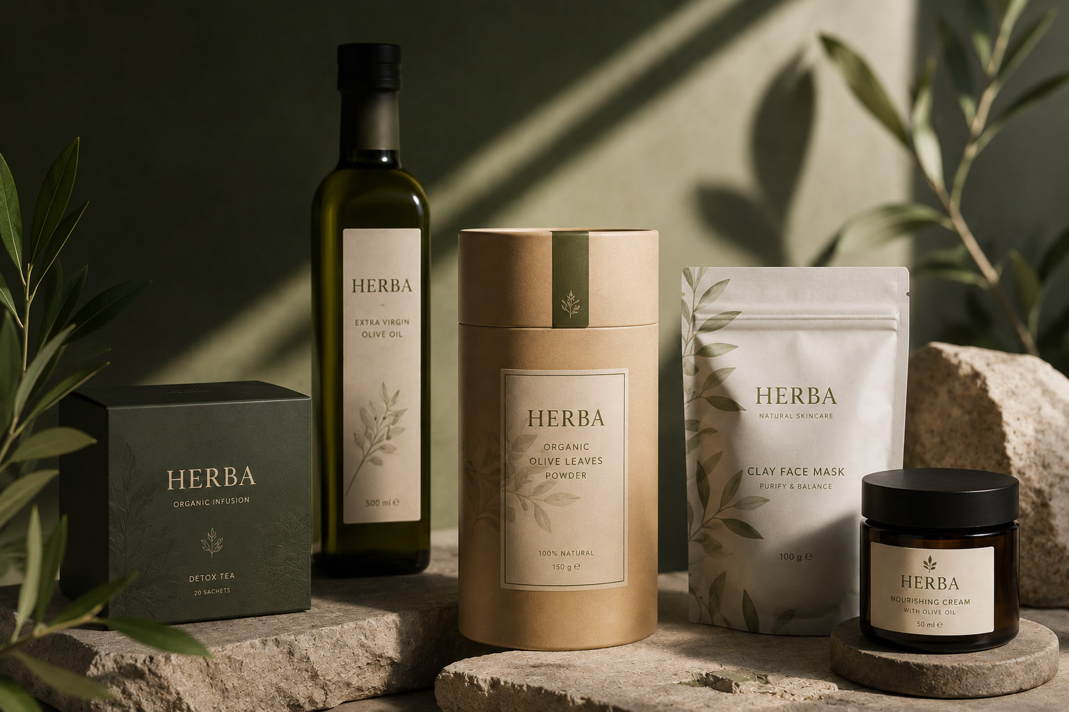
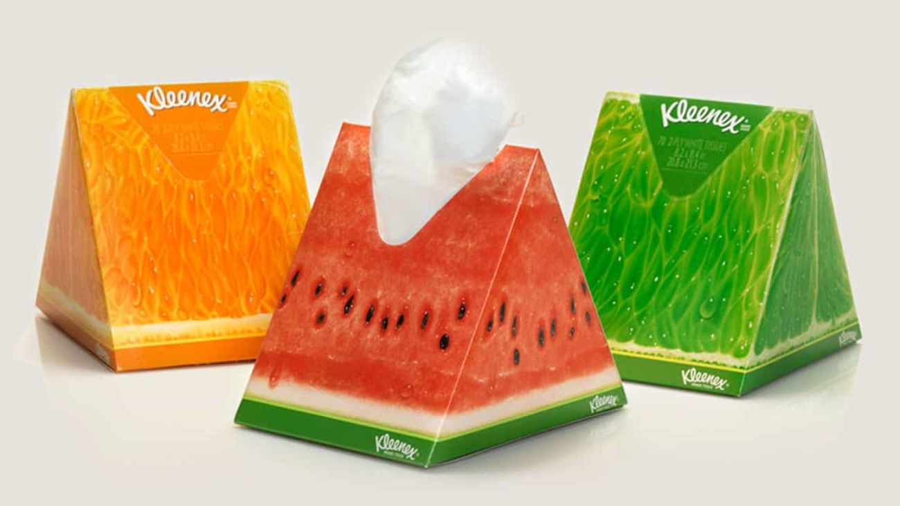
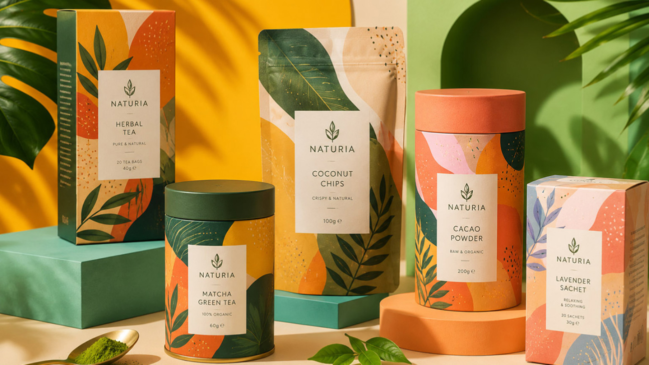
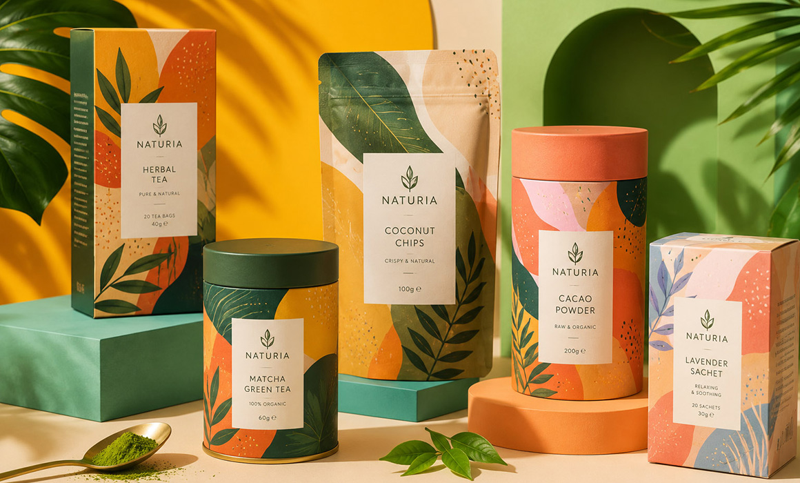
An example of minimalism in packaging design

4. The Right Use of Colour Changes Brand Perception

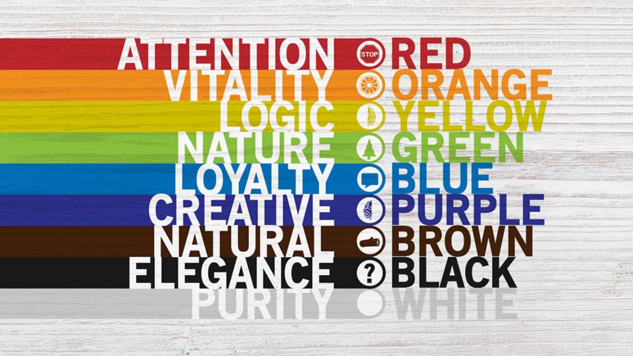
Colours directly affect consumer psychology.

For example:

  • Black → a premium, powerful impression
  • White → a clean, modern appearance
  • Green → a natural, healthy feel
  • Red → an eye-catching, energetic effect
  • Gold details → a sense of luxury

Choosing attractive colours is only part of the task.
The colours also need to suit the product category.

For example, presenting a natural product in excessively bright, aggressive colours can undermine trust.

5. Packaging Needs to Look Strong Online, Too

Products now compete in Instagram posts, advertising videos, and e-commerce stores as well as on physical shelves.

Modern packaging design therefore needs to:

  • Photograph well,
  • Reflect light effectively,
  • Remain legible on a mobile screen,
  • Create a strong visual impact on social media.

For many brands, packaging has also become a tool for creating content.

For premium products in particular:

  • Well-presented mockups,
  • Realistic product photography,
  • High-quality lighting
    Can significantly enhance the brand’s value.

6. Print Quality and Material Selection Matter as Much as Design

Even beautifully designed packaging can lose all its impact if it is printed poorly.

That is why:

  • Matte or gloss lamination,
  • Varnish finishes,
  • Foil details,
  • Paper selection,
  • The choice of a stand-up pouch or box format

Are integral parts of the design.

In the premium segment especially, even small finishing touches can completely change the way a product is perceived.

7. Successful Packaging Design Has a Direct Impact on Sales

Packaging is more than an aesthetic exercise.
It is also a powerful marketing tool.

A well-executed design:

  • Helps a product stand out on the shelf,
  • Builds trust in the brand,
  • Increases the product’s perceived value,
  • Speeds up the purchase decision.

Today, many consumers will buy a product they have never tried before simply because they trust its packaging.

Conclusion

Successful packaging design brings together aesthetics, strategy, and brand perception.

Well-designed packaging:

  • Sets a product apart from its competitors,
  • Makes the brand look more professional,
  • Attracts attention online,
  • Supports sales performance.

People often form a connection with a product’s packaging before they ever use the product itself.

And strong brands never leave that first encounter to chance.

The Language of Colour in Design

The Language of Colour in Design

Skip to content

Menu

Home / Journal

On design

The Language of Colour in Design

The Language of Colour in Design

In my previous article, I discussed The Importance of Logo Design, explaining what goes into creating a corporate identity and the finer points a logo should embody. Here, I will explore colour in more depth, building on that brief introduction, because the language of colour in design is not a subject you can simply skim over.

Indeed, entire logo concepts can be developed around the effects of colour alone. From a designer’s perspective, I can confidently say that colour is one of the foundations of a design and can make the whole piece look either successful or unsuccessful.

Through their associations, colours can communicate your character, corporate identity, personality, and even your outlook on life. You can see how colours reflect emotions and shape moods. Imagine you are having an unhappy day and need to go out. What would you choose to wear? Probably something dark. Similarly, when you sit down to design in a gloomy mood, the colours you choose are likely to reflect that mood. When I experience this as a designer, I usually take a break and try to do something enjoyable to lift my spirits. Keeping my personal mood out of my work is one of my strongest professional principles. I always approach corporate design work professionally and take care to use colour appropriately.

The most commonly used colours are red, black, blue, green, brown, purple, and pink in that order. Let us look at the meanings these colours evoke and communicate to the viewer.

Red: There is a familiar Turkish saying: “Make it red, even if it costs a little more!” There is a reason behind it: red represents vitality and dynamism, bringing a sense of happiness to its surroundings. It is also an appetite-stimulating colour, which is why many food companies deliberately choose red for their logos.

Black: Black often suggests emotion and sadness, while also representing power. Although it symbolises sadness and mourning in Turkey and many other countries, in Japan it represents happiness, in contrast to those countries. Its association with dignity may also make it one of the most popular colours.

Blue: Blue is the colour of the endless sky and the vast sea. It is one of the colours I enjoy using in my work. It represents peace, calm, a sense of freedom from limits, and freshness. Think of the peace you feel after spending hours looking at a deep-blue sea. That is the effect of blue, and it is why the colour matters so much in design.

Green: Green represents nature and spring. Its vitality gives it energy, refreshing people and inspiring trust. It is frequently used in finance to convey that sense of trust. It is also one of the most popular colours in food and healthcare because of its associations with nature and the environment.

Brown: Brown is the colour of genuine emotions and discipline. Scientific studies suggest that brown has an accelerating effect on the human brain.

Purple: Purple represents grandeur and a luxurious lifestyle, although I would not say it is used very often in design. A colour favoured by young women and women more generally, purple actually represents neurotic feelings.

Pink: Pink has a happy effect on people. It directly conveys a sweet, cheerful, and charming image. Especially popular with children and used in child-related sectors, it represents love and comfort.

The Language of Colour in Design is, as you can see, extremely important. Attention should extend beyond typography or the details of a logo’s emblem: the logo also needs the right colours to represent the organisation and its industry. Even the negative feeling conveyed by a logo and its colours can cost a business customers. Imagine a bottle of water with a red label. How healthy or cool would it feel to you? Something to think about!

Your Brand's Identity: Logo Design

Your Brand’s Identity: Logo Design

Skip to content

Menu

Home / Journal

On design

Your Brand’s Identity: Logo Design

Your Brand's Identity: Logo Design

Today, I want to write about the importance and necessity of logo design from a professional designer’s perspective, because I believe the subject is often only partially understood.

In broad terms, a logo is an essential part of corporate identity: it reflects the identity of your product or brand and communicates the impression you want to create as clearly and concisely as possible. At every stage of building a brand, it represents the company or brand itself. Before I start designing a logo, I always conduct field research, carefully analyse competitors, and focus on the central idea we want to bring forward so that I can establish the right direction.

Every organisation, large or small, from textile companies to sports clubs, has a logo. Customers often see a logo as a corporate brand in its own right, so they tend to choose products bearing logos they know and recognise. A logo is therefore both a symbol and an important face of branding. Like other professional designers, I see the relationship between a brand and its logo as inseparable.

Simplicity and the right use of colour are among the essentials of a memorable logo. An original logo that reflects the organisation it represents, with colours suited to its sector or product, inspires trust in consumers. Each colour has its own qualities, so the colours used in a design should be chosen deliberately rather than at random. Every detail matters in logo design, and originality and colour are what make a logo stand out. Choosing colours arbitrarily, or simply because you like them, is hardly a professional approach. When people ask for my advice, I recommend combining a pattern, motif, symbol, or other shape that represents the company with a colour chosen for its meaning. I plan to explore this subject in more detail in my next article.

Branding and logos are essential today, and the need for memorable, creative logo design is widely recognised and given the attention it deserves. Many companies, organisations, and even national governments run competitions to find the ideal logo to represent important initiatives. All of these details underline the importance of logo design.

The Impact of Artificial Intelligence on Graphic Design

The Impact of Artificial Intelligence on Graphic Design

Skip to content

Menu

Home / Journal

On design

The Impact of Artificial Intelligence on Graphic Design

The Impact of Artificial Intelligence on Graphic Design

Rapid advances in technology are bringing significant changes to many industries. Graphic design is one of the fields most affected. Through the innovations it brings to design, artificial intelligence is redefining both efficient workflows and our understanding of aesthetics. In this article, we will explore its impact on graphic design.

1. Automated Design and Creativity

By accelerating and automating design processes, artificial intelligence expands designers’ creative potential. Automated design tools help designers identify and apply core elements such as colour palettes, compositions, and typography. This makes the process more efficient and gives designers more time to devote to creative thinking.

2. Personalised Experiences

Artificial intelligence can deliver personalised visual experiences by analysing users’ behaviour and preferences. Websites, apps, and other digital platforms can offer tailored content and designs based on a user’s past interactions. This allows people to have a more personal and meaningful experience.

3. Presenting Information Through Data Analytics

Artificial intelligence is making the use of data analytics in graphic design more effective. By analysing large datasets, AI can highlight important information and help present it in visually effective ways. Infographics, charts, and other data visualizations make it much easier for designers to turn complex data into something understandable.

4. Deepfakes and Art

Artificial intelligence is also making its presence felt in the art world through deepfake technology. Artists can use AI algorithms to create new and compelling works. Combining real-world objects or people with designed content through deepfake technology also opens the door to surreal, innovative artwork.

5. The Future of Design: Collaboration

Artificial intelligence offers unprecedented opportunities for collaboration in graphic design. Designers can work alongside AI systems to create more complex and advanced designs. By combining human creativity with AI’s analytical capabilities, this collaboration makes original, compelling work possible.

In conclusion, artificial intelligence is transforming graphic design, encouraging designers to become more creative and effective. In the future, the collaboration between these two fields will inevitably grow stronger, taking graphic design into a more exciting phase with the guidance of artificial intelligence.

The Importance of Branding

The Importance of Branding

Skip to content

Menu

Home / Journal

On design

The Importance of Branding

The Importance of Branding

Branding is the broad term for the process through which products, companies, individuals, or organisations acquire an identity and standing. A product or organisation needs a name, and therefore a brand, to establish its place in the market. The entire design process, including logo and image development, lays the groundwork for corporate identity and helps complete the branding process for the product or organisation.

A systematic approach to branding is needed to secure a strong position in the market and reach the target audience. The logo that represents the product, the newsletters that introduce the company, and all the visual work that helps it take root in the audience’s mind are steps along the way. In every project I have undertaken or been involved in, I have developed work tailored to the company and product to make the branding process effective, high-quality, and focused on results. This could be a logo, slogan, advertising jingle, bespoke packaging, or a company ritual. Looking at global brands, we can see names that have become recognisable through a single colour or graphic. Does that make branding easy? Of course not. Sometimes a slogan alone can come to identify a brand, but reaching that point involves many important company and PR activities, some visible to consumers and others unseen. A strong logo or an impressive commercial is never enough on its own to build a brand. Ideas and their execution provide the substance that brings these elements up to the intended level. Every idea developed and every initiative put into practice affects consumers differently. Social responsibility projects, charitable events, campaigns tailored to the target audience, and even a brand’s stance on the environment and developments in its industry worldwide can directly influence the branding process.

One of branding’s most important effects on consumers is creating the association that a useful product is a branded product. People prefer to buy what they need from a brand they know. This makes the logo and promotional materials, the visual face of the brand, especially important. Simple, memorable logos help a brand take root more easily in consumers’ memories.

My professional view is that building a brand calls for steady, deliberate steps. Start by developing the company’s public-facing identity, then use resources wisely to make effective moves toward a place in the global market.

Love in Three Seconds: Packaging Design

Love in Three Seconds: Packaging Design

Skip to content

Menu

Home / Journal

On design

Love in Three Seconds: Packaging Design

Love in Three Seconds: Packaging Design

Today, I wanted to explore an important subject for anyone interested in design, and I chose packaging. Packaging is like a product’s clothing: it sometimes commands more attention than the product itself, helps it stand out from competitors on the shelf, and gives it a presence. The more successfully packaging is designed, the more effectively it attracts its target audience.

Although packaging primarily exists to protect a product from external influences and keep it fresh, design turns it into an advertising and marketing tool in a competitive market. Packaging protects a product against damage, impact, moisture, and drops, while its design announces what is inside and allows the product to say, “I’m here.”

Because packaging design gives the product a voice, the designer needs fresh, well-judged ideas. In the packaging projects I have worked on, I have aimed to create eye-catching designs that bring the product forward, draw selective attention, and put it ahead of competing products. This requires thorough research into the product’s features, history, customer profile, and competitors. Only after that research can a sound, successful packaging design emerge.

As I discussed in “The Language of Colour in Design”, colour is also one of the most important factors in packaging design. Choosing colours that evoke the right emotions in potential buyers, and analysing how colour can encourage a purchase, helps make a design successful. Colours can make packaging feel lively, cheerful, warm, and energetic, or they can make it feel cold and convey negative, unpleasant emotions. The imagery, patterns, typefaces, and, above all, colours must therefore be chosen for the target audience and brought together appropriately in the design.

According to research, consumers take three seconds from first noticing a product to deciding whether to buy it. Forming an emotional connection in that brief moment and encouraging the customer to choose you demonstrates the power of the right packaging design.

Common Logo Design Mistakes

Common Logo Design Mistakes

Skip to content

Menu

Home / Journal

On design

Common Logo Design Mistakes

Common Logo Design Mistakes

A logo is the public face of an individual business or organisation, which makes every detail important. As a professional designer, I sit down to each project with that responsibility in mind. Every element of a logo, from its colours to its graphics, reflects the company’s image, so even a small mistake can damage its reputation and undermine that image.

The professional design world contains beautiful, creative work, but unfortunately it also contains designs full of mistakes. Today, I want to look at common mistakes in logo design, particularly to offer guidance to young people who are just starting out in the profession.

Designing Without Research

One of the most frequent mistakes is starting a design with only the few details supplied by the client, without conducting any research. This approach leads to work that is incomplete, careless, and, unfortunately, does not reflect what the client wants. When designing a logo, a designer should go beyond the client’s brief, carry out independent research, examine competitors in the relevant sector, and analyse the consumers the logo needs to reach.

Making a Logo Too Complex or Detailed

A logo should be simple, clean, and easy to understand. When a company’s or brand’s name is mentioned, its logo comes directly to mind. Many designers unknowingly make the mistake of creating something too complex and burdened with detail. People who do not understand design, or who underestimate its power, may not notice this complexity and may even like it. For a designer, however, work like this is a real failure in terms of their portfolio and standing in the design world. Trying to fit every service an organisation offers into a single logo makes it look cluttered and careless. At every stage, it helps to think of the logo as a signature or image that represents the company. Studying the logos of major global brands can be a useful source of inspiration.

Using Ready-Made Assets

To create a bespoke logo, every asset used in its design, including vectors and graphics, should be original and made from scratch. Assets bought from stock vector and graphics sites make a logo look similar to others and diminish its originality. There is a strong chance that a vector you purchase and include in a logo will later appear in other logos and designs. If you care about your work and take pride in it, that should show in what you create. Professionalism demands it.

Choosing the Wrong Colours

Colour is the backbone of logo design. Poor colour choices weaken a logo, no matter how good its graphic form may be. Designers need to understand how colours affect emotions, research the relevant industry and target audience, and select the most appropriate colours.

Too Many Fonts

Designers enjoy using distinctive fonts and strong letterforms. As a designer, I also draw on typography frequently in my work. But one of the biggest mistakes is using too many fonts at once. The principle of simplicity needs to be remembered at every stage of a logo’s development. For type-led logos, the choice should be limited to no more than two different fonts. Using one or two is normal and acceptable; more than two makes a logo look confused and indecisive. To create a strong statement, use a maximum of two fonts.

Getting Packaging Design Right

Getting Packaging Design Right

Skip to content

Menu

Home / Journal

On design

Getting Packaging Design Right

Getting Packaging Design Right

Packaging design is one of the fundamental elements that help sell a product. Looking at the market, we see many brands, and almost every brand produces goods of similar quality to others in its sector. We see these products on the shelves under different brand names and in different packaging designs, and we generally choose a brand we recognise, know, and trust.

A new brand that wants to break these shopping habits must undoubtedly find a way to stand out in every detail. But how? Through packaging design, advertising and promotion, campaigns, and many other approaches. When you think about it, all this work directs people toward the product, so the last thing they remember, or the one thing that stays in their minds, is the product’s visual appearance: its packaging design. This helps explain why packaging design is so important and why it is one of the fundamentals. So what makes successful packaging design? What should good packaging offer its target audience? Let’s explore this through my experience in the industry.

Packaging should communicate with the customer.

All the graphics and written messages on a package should communicate with the customer in a way that says, “I’m here. Come and buy me.” Engaging the target audience directly affects product sales. When designing, I often ask myself what would catch my attention on this product’s packaging and make me go and buy it. The answers form the foundation of my design.

The design should not be boring or monotonous.

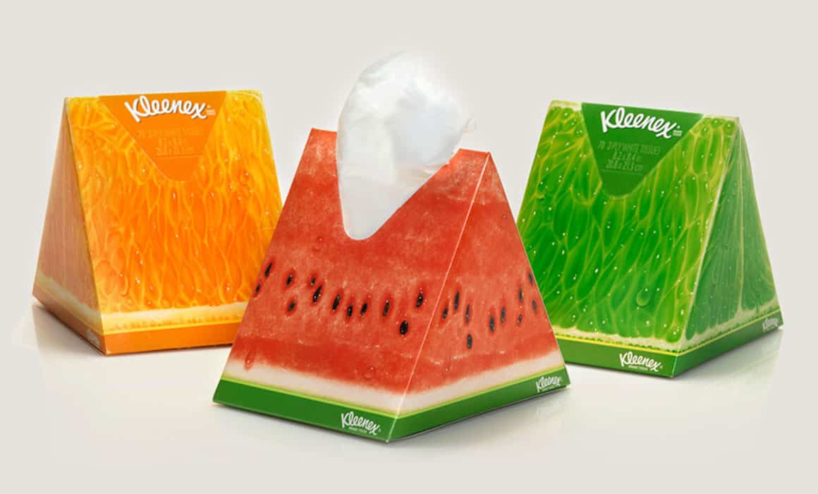
Within the boundaries set by brand managers, packaging should favour innovative, compelling designs. For example, the smiling faces on newer crisp packets are an invitation to have fun in their own right. You have almost certainly seen someone on social media holding a crisp packet up to their face and posing for a photo with an enormous smile. New designs like these, which suit the product’s characteristics and can appeal to its target audience and attract their interest, will always take your brand a step further.

Custom packaging is a major advantage.

When designing packaging, I like to begin by examining the actual product and looking at comparable products. This helps me get to know the product and, by understanding competitors’ designs and packaging formats, gives me a sense of the direction I should take. Beyond the graphic design, a distinctive packaging shape of your own is a major advantage. Examples include Eti Puf’s packaging and the cola bottle shape that has become a brand signature over the years. Within your budget, developing an original packaging shape suited to your product, either before or alongside the design process, will add considerable value to your brand and its prestige.

Colour Harmony in Packaging Design

Colour Harmony in Packaging Design

Skip to content

Menu

Home / Journal

On design

Colour Harmony in Packaging Design

Colour Harmony in Packaging Design

One way to communicate a product and its intended message as accurately as possible through packaging design is to use the right colours. Chocolate products, for example, are generally designed in warm tones such as red and brown. Packaging for chocolate rich in pistachios uses green alongside images of pistachios for emphasis, while black is preferred for dark, or bitter, chocolate. One reason for these colour choices is to communicate what the product is and what it contains as quickly as possible at first glance, before anyone reads the text on the package, and to create the desire to buy it.

Red is widely used in packaging design in the food sector. Because red stimulates people’s appetite, it dominates not only packaging but also corporate designs such as the logos and signage of restaurants and fast-food chains. Of course, launching look-alike packaging simply because of this association with red would not make much sense. Analysing competitors and taking innovative steps always help a brand and its products stand out. Using a completely contrasting colour can also help a new product make an impression quickly. These are all marketing strategies.

Using the right colours is very important when designing packaging. If, for instance, you design a red label for a bottle of water, it will evoke warmth rather than the cool, fresh feeling associated with blue. Naturally, a bottle of water that feels warm is hardly appealing to someone who is very thirsty in hot weather. That is why using colours in the right places and in the right proportions has a significant influence on a product’s sales success or failure.

The most fundamental purpose of packaging is to protect the product and extend its shelf life. Its second, commercial purpose is to present the product to consumers, explain its contents, and encourage demand and purchase. Packaging should therefore be made from quality materials while also visually calling out to the consumer, “I’m here!”

When you are walking down a supermarket aisle, the packaging’s design or colours are the main reason for that brief moment that suddenly stops you and makes you examine, and perhaps buy, a product you have never tried before. The first five seconds are important for packaging to communicate with the consumer. At this point, our task as designers is to use not only colour but also our creativity to develop packaging that is different, new, and attention-grabbing.

In my earlier blog post, “What Should Packaging Design Be Like?”, I discussed the relationship between product, packaging, and consumer, and touched on what makes good packaging. I should emphasise once again that, although colour is a key factor in packaging, it must be supported by creativity.