ambalaj-tasarimi

3 seconds of love; packaging design

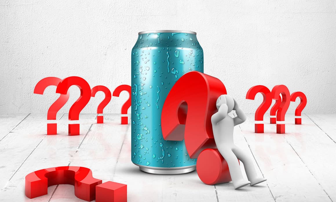
For design enthusiasts, I wanted to tackle an important topic today and I chose packaging design. Packaging design is like an outfit that sometimes gets ahead of the product, makes it stand out from its competitors on the shelf, in short, creates it. The more successfully a package is designed, the more it attracts its target audience.

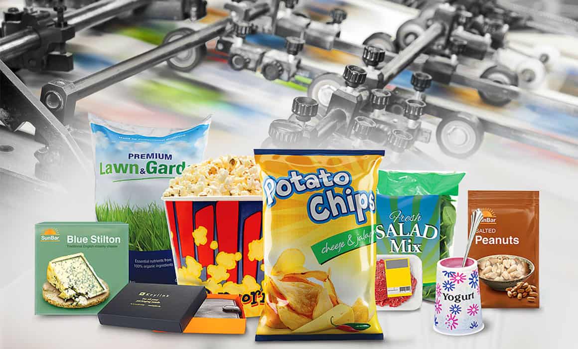
Although the main reason for packaging is to protect the product from external influences and to keep it fresh, in the competitive market, packaging meets design and turns into an advertising and marketing tool. Packaging; While protecting the product from damage, bumps, getting wet and falling, it also introduces the existence of the product inside with its design and makes it say I am here.

Since it is the packaging design that makes the product speak, at this point the designer must be full of innovative and correct ideas. In the packaging designs I have made so far, I have tried to make designs that will bring the product to the fore, that will cause people to be selective in perception, and that will get ahead of competing products. While doing these, it is necessary to research the features of the product, its history, customer profile and competitors. Only after such a research can a healthy and successful packaging design be produced.

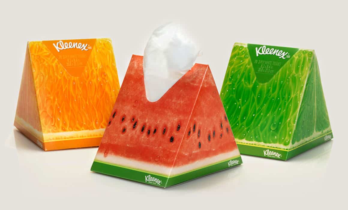
As in the “The Language of Colors in Design” article I mentioned before, color is one of the biggest factors in packaging design. Choosing the colors that will activate the emotions towards the potential buyer, and color analysis to guide the purchase will make the design successful. While the colors used can show the packaging lively, cheerful, warm and energetic, they can also show it in a way that spreads cold, negative and bad feelings. For this reason, the images, patterns, fonts and most importantly the colors used in the packaging design should be chosen correctly according to the target audience and should be combined with the design in an appropriate way.

According to research, the time it takes the consumer to make eye contact with the product and decide to buy is 3 seconds, and to establish an emotional bond with the customer in this short time and to make them choose you, this is the power of a correct packaging design.
Dogru_ambalaj_tasarimi

Correct packaging design

Packaging design is one of the most basic elements that sell the product. When we look at the market, we see many brands, almost every brand produces products of similar quality in the sector it produces. We see these products on the shelves with different brands and packaging designs, and generally we choose the product of the brand we know, know and trust.

A new brand that wants to destroy all these shopping behaviors must find a way to stand out from the others in every detail. So how? With packaging design, advertising and promotion services, campaigns and many other methods. When it is considered, the last thing that stays in mind or the only thing that takes place in the minds is the visual of the product, namely the packaging design, since all the work done directs the product. In this way, it is possible to see that packaging design is important and is among the basic elements. Well, how should a successful packaging design be? What should a good packaging design offer to the target audience? Let’s examine it based on my sectoral experience;

Packaging should communicate with the customer.

All graphics and text messages on the packaging should communicate to the customer, creating the image that I am here, come and get me. Engaging with the target audience directly affects the sale of the product. In my designs, most of the time, I ask myself the question of what would attract my attention and buy it. The answers form the basis of my design.

The design should not be boring and monotonous.

Innovative and impressive designs should be preferred in packaging designs in line with the boundaries drawn by brand managers. For example, the smiling faces in the new generation chips packs invite people to have fun on their own. New designs that are suitable for the features of this and similar product, that can affect the target audience and attract their attention will always take your brand one step higher.

Custom packaging is a big plus.

When designing packaging, I like to personally examine the current product and look at its equivalents. I can say that this not only allows me to get to know the product, but also signals the way I should go by getting to know the competitors about the design and form. Apart from the packaging design, it is a huge plus that the packaging form is special and unique. For example, Eti Puff packaging, such as the bottle form that has become a brand of coke for years… Creating a unique packaging form suitable for your product in different forms within your budget, before or at the same time as the design, will contribute to your brand and prestige as a great value and plus.

Ambalajda Tasarımında Renk Uyumu

Color harmony in packaging design

One of the most accurate ways to convey the product and the desired message in packaging design is to use the right color. For example, chocolate products are usually designed in warm tones such as red and brown, a chocolate package with plenty of pistachio is highlighted with a green color with pistachio kernels, while black color is preferred for dark (bitter) chocolate. One of the reasons for these color preferences is to convey to the other party what the product is and what it contains, as soon as the first contact is made without reading the text on the package, and to awaken the feeling of purchase.

In packaging design, red color is preferred intensely in the food industry. Since red color is appetizing for people, red color is dominant not only in packaging but also in logo and signage style corporate designs of restaurants and fast-food chains. Of course, due to this perception created by red, it would not be a logical move to come to the market with identical packaging designs. Making competitor analysis, taking innovative steps always bring the brand and product to the fore. By using a completely opposite color, you can make a new product have an impact on people in a short time, these are purely a marketing strategy.

It is very important to use the right colors when designing packaging. For example, if you prepare a red label design on a water bottle, the red color will make you feel warm, unlike the cold and fresh feeling that the blue color gives. Therefore, using colors in the right place and in the right ratio has a high impact on the success or failure of the product in sales.


The main purpose of packaging is to protect the product and increase its shelf life. The second and commercial purpose is to show the product to the consumer, to introduce its content, to ensure that it is requested and bought. Therefore, the packaging should consist of both quality materials and visually “I am here!” it should appeal to the consumer.

The main reason for that brief moment that stops you abruptly while walking in a market aisle and perhaps causes you to examine a product you have not used before is the design or colors of the packaging. The first five seconds are important for the packaging to communicate with the consumer. At this point, as designers, we not only use colors when creating the packaging, but also use our creativity to design a different, new and attractive packaging.

Previously, “How Should Packaging Design Be?” In my blog post titled, I gave information about the product – packaging – consumer relationship and mentioned how a good packaging should be. Although the main factor for the packaging is color, I must state once again that it must be supported by creativity.

ambalaj-tasarımının-incelikleri

The subtleties of packaging design

Packaging design is one of the subjects that have been studied for many years. With the development of technology, packaging design has also become digital like everything else and has received its share of the blessings of technology. Depending on the results of the research conducted by the survey companies on different sectors, the level of competition and the analysis of the needs, changes are made in the packaging designs from time to time. Because the packaging of a product can be ahead of its competitors with its colour, texture, appearance, shape and even smell. As a matter of fact, packaging design is one of the factors that greatly affect the sales of a product.


Attention has been drawn to the importance of packaging design in our country in recent years, and many companies have started to receive professional support for their products in this regard.

Color is one of the most important choices to be made during packaging design. Using colors that will reflect the originality of the product, the difference between it and the product’s unique character is a good way to stay in the mind of the target audience. The logo, if any, should be placed nicely on the packaging. The colors, symbols and general form of the packaging should be detailed in detail. Color and design are the things that attract the attention of the consumer, take the product in his hands and start to examine it more closely.

After color, typography is the second element to be considered during packaging design. The font should reflect the character of the product and contain originality. Therefore, the font should be carefully selected, the choice of characters should be in harmony with the product and understandable. Then, the content of the articles should be strengthened and the consumer should be encouraged to buy this product. The selection of appropriate typography for packaging design varies according to the product to be designed, the features of this product, the issues that need to be addressed in the sector and the current expectations of the target audience to be addressed.

In general, packaging design revolves around the triangle of harmony, originality and attractiveness. Packaging designs that are successful in terms of these three concepts are loved and preferred by consumers. Therefore, getting support for packaging design from a professional who is knowledgeable about the content of these concepts will be the most beneficial for you and your product and will affect you and your product positively.

Ambalaj-Baskı-Teknikleri

Packaging design printing techniques

Product packaging can be made much higher quality with the graphic designs, aesthetic ideas and printing techniques applied on it. In order for the design you have made to have the same strength on the shelves, first of all, the design must be prepared in accordance with the printing technique and the prepress repro works must be done correctly. Therefore, what you need to do is to first determine the printing technique suitable for your product, and then have a designer who has mastered this printing technique design your packaging.


The design may not be suitable for all kinds of printing techniques, a successful packaging design is one made in accordance with the printing technique.

Generally, there are 5 different printing types that will make your packaging designs come true;

1- Offset Printing

Offset printing is a type of printing made on papers of many different weights. It is the most common printing system that is generally preferred in the printing of many different products such as business cards, magazines, books, newspapers, posters, display boxes. It is one of the most useful prints among packaging techniques and can be used for labels and cardboard boxes in many sizes.

2- Intaglio Printing

This printing system is indented printing, the designs are processed by machines with diamond-tipped material on the metal plate, the ink on the entire cylinder is erased during printing, the inks remaining in the cavities are transferred onto the packaging, allowing the printing to occur. Intaglio printing, which is generally used in chips, chocolates, biscuits, dried food and nuts, milk powder, coffee and scientific food packaging, is used in vivid and striking products as can be seen from the examples. It is also preferred for its intaglio print quality, it is generally preferred for high circulation works due to the cost of cliché alone.

3- Flexo Printing

Flexo printing technique has a very important place in the packaging industry. Flexo printing technique can be used in the packaging of many products using PP and OPP materials such as pasta packages, pulses packages, frozen foods and candies. Packages printed with this technique have a flexible, hygienic and glossy appearance. Although it has lower quality than intaglio printing, it is very economical in terms of the cost of clichés and rapid production.

4- IML Printing

IML printing is also known as label printing. This printing system is created by integrating injection system and plastic materials on offset printing. Hazelnut or peanut butter packages, yoghurt and cheese packages, milk packages, puddings and desserts can be packaged with this printing technique, so that the label is combined with the container it is in and is prevented from being damaged. As can be seen from the examples, IML printing is a type of printing that is mostly used in food products.

5- Screen Printing

Screen printing is a general name given to printing on products such as glass, plastic, metal and wood. Logically, the design embroidered on silk stretched into a frame is achieved by exposure of the design under suitable conditions, and by transferring the paint to the product only from the light-receiving parts.

6- Digital Printing

Paper, canvas, fabric, synthetic, wood, stone, etc., by means of digital printing machines of the designs prepared in the computer environment. It is the process of printing on materials. Since no molds or clichés are used, it is a suitable solution for variable and small product printing.